Logo Design
A logo is often the first impression people get of your company or organization. As such, your logo should be established at the inception of any new business. Do not make the mistake of dismissing a logo as just a graphic related to your industry. Interacting with a professional logo designer should challenge you to hone in on the most important goals and aspects of your company as you choose the symbolism to use in your logo. This is important not only for logo design, but also for planning and identifying the main focal point of your business.
High quality, professional logos share the following characteristics:
- Simple – Should not try to incorporate too many design elements
- Original – Should not be a cookie cutter logo that is shared by other companies
- Recognizable – Easy to remember and associate with the company it represents
- Credible – A professional design communicates the company is trustworthy
- Scalable – Vector image that looks good in a wide range of sizes
- Effective – Even without color
Logo Design Process
Plan & Research
We will communicate with you about your company’s main goals and discuss design elements that could effectively portray those objectives. We will look at the logos of top companies in your industry and research what works and what doesn’t work.
Design, Reflection & Redesign
Great logos often go through many stages before developing into their final forms. After we come up with an initial concept, we reflect on the following question: “How could this logo be simplified and yet still remain just as effective?” Then we go back to the drawing board for revisions. More often than not, multiple revisions are necessary before the logo takes on the above characteristics of a high quality, professional logo. This is why we don’t believe in $5 logos. Cheap logos communicate “cheap company”, because the amount and quality of thought that goes into a logo represents the amount and quality of thought that goes into a company.
Animated Logos
Ask us about animating your logo.


Logo Examples
Farmer’s Pal
Farmer’s Pal is a directory of organic, sustainable, and local farms and products. We considered using an apple in the logo, since an apple commonly represents healthy food. However, this designed relied heavily on color, and we felt it could be simplified.

In the final design, we chose to use only a single leaf instead of a whole apple. A leaf represents plants and farming, and green represents growth and “green” products.

Make Worship
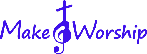
Make Worship is a Christian worship resource website. We wanted to incorporate music, a cross, and possibly a guitar into the design to appeal to worship musicians. Originally, we attempted to combine a treble clef, acoustic guitar, and a cross into one symbol. Unfortunately, it looked a bit confusing and didn’t meet the “simple” and “recognizable” aspects of a good logo:

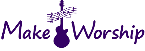
In the final design, we decided to create the cross element by adding a musical measure across the neck of a guitar. The ideas of music and a musical instrument are immediately apparent in the new design. Even if some people miss the subtle cross, the goal of the company is obvious when the word “Worship” is factored in.

Purple was chosen to signify the royalty of King Jesus; however, the logo looks good and is recognizable in any color.
